Review: Redmi Note 11
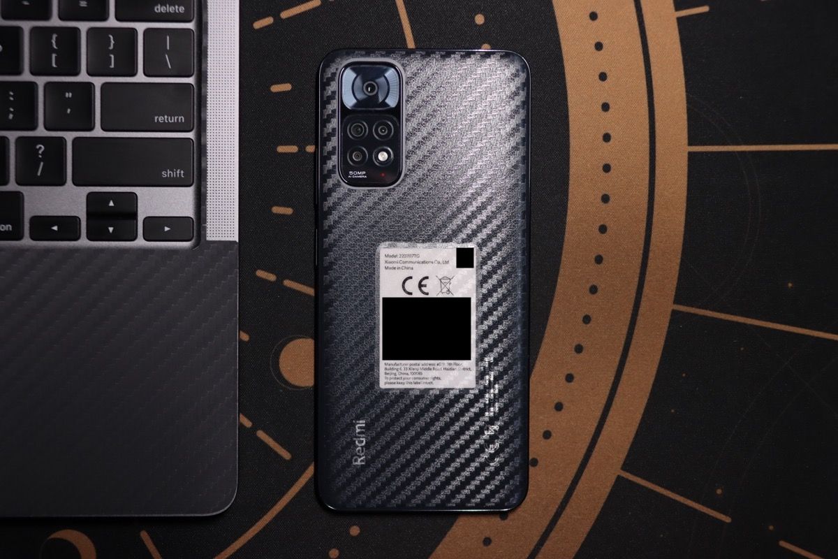
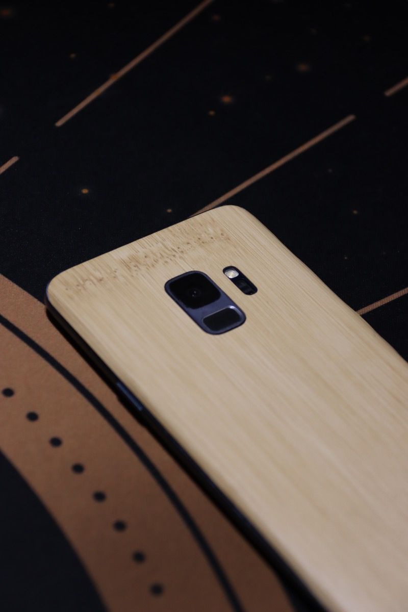
Before I got this phone, my daily driver was a Galaxy S9. It was a fantastic phone, one that I had no complaints about; that was, at least, until the battery started dying so quickly I needed to top up twice a day just to get to dinner with some juice left.
There wasn't anything wrong with it aside from the battery, so I had the battery replaced in the hopes of making it usable again. The new battery was, however, almost as bad as the old one. I chalked it up to both batteries likely being made during the same time frame, and so I cut my losses and began my search for a new phone.
I'd like to preface this by saying that the heaviest usage I put a phone through is creating Instagram Stories. I do not play games, watch shows or movies, or otherwise do things that run a battery flat before the day ends – I prefer to do those things on bigger screens. So, while a new iPhone SE would have been nice, I didn't need that much power. Battery life, and ideally camera quality, were what mattered most to me.
Enter the Xiaomi Redmi Note 11: for a price just shy of Php10,000, you get a 5,000 mAh battery, a 90Hz screen, stereo speakers, a headphone jack, four cameras, and even IP53 splash resistance. It is very hard to complain about this phone with a price this low, but of course, I come from a flagship device, and things to complain about are easy to come upon regardless.
The bad
I believe in an inverted approach to reviews: get the bad things out of the way first, before talking about the good things. That way, you get to see if there are any dealbreakers you have to know about and move on to other products if so.
The camera system
The Redmi Note 11 is equipped with three cameras and a depth sensor. The main camera sensor is 50 megapixels, to which the phone applies pixel binning to obtain 12.5-megapixel photos. The other two are an ultrawide and a macro sensor, both located on the left of the flash. The former kicks in when you zoom out to 0.6x in the camera app, while the latter kicks in when you activate the Macro mode from the camera's upper hamburger menu. I presume the depth sensor, located above the flash, is used for enhancing portrait mode.

I'll get this out of the way: the cameras on the Redmi Note 11 suck. When natural light is abundant, they spit out so-so pictures, good enough for sending to friends but not for populating your dating app profile. Once you head inside and away from light, however, the images you get will start to look like an absolute mess.
I'll let some sample photos do the talking, with some shots from my Galaxy S9 for comparison.
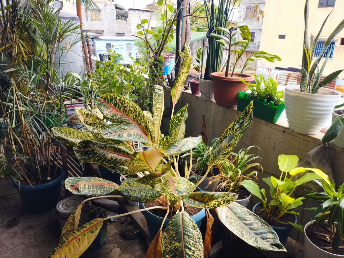
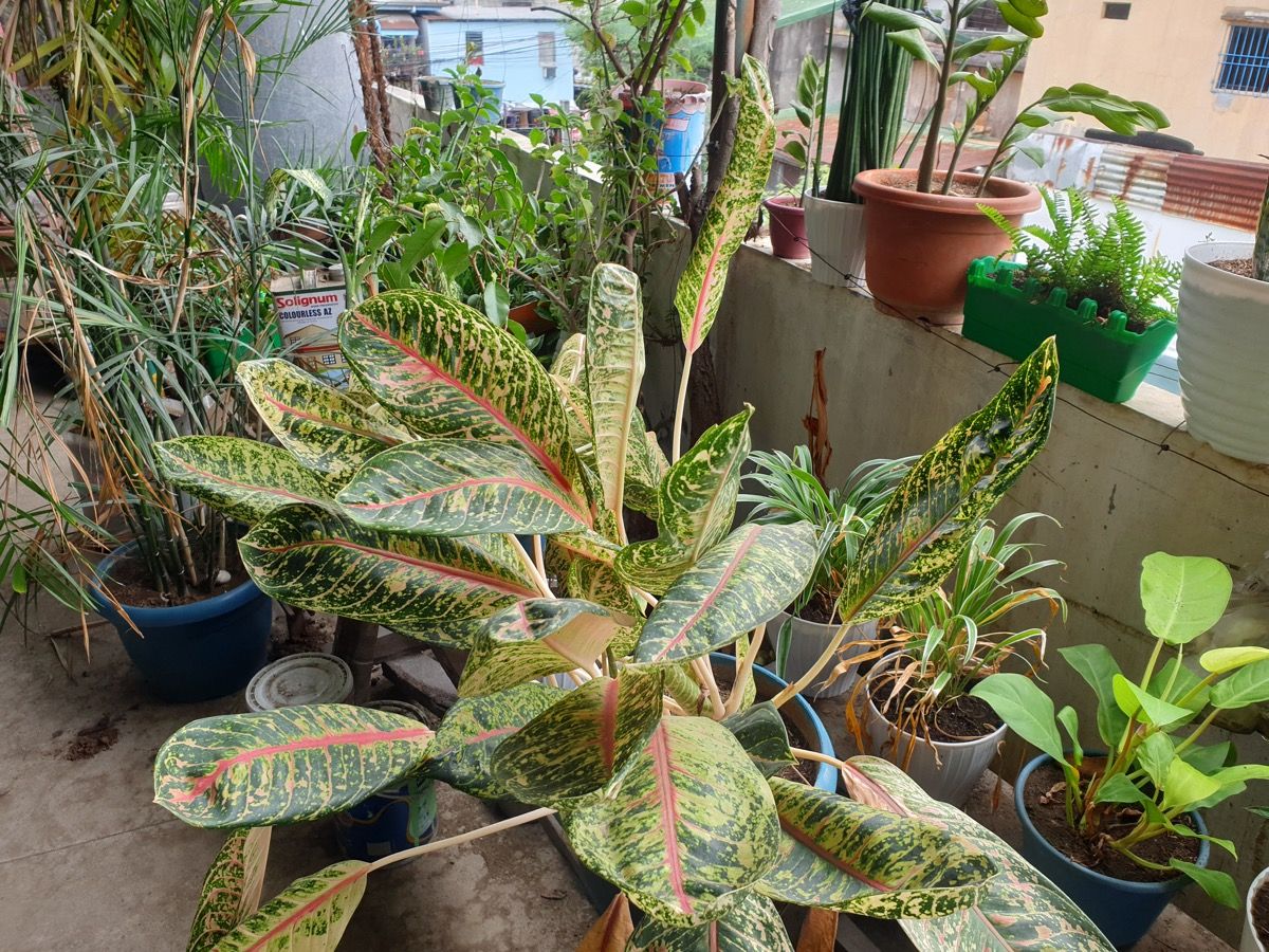
In the above scene, both phones produced nice shots, with the Redmi opting for warmer tones overall. There is a lot of contrast here, and thus both phones automatically flipped on HDR mode. You can see that the Galaxy S9 did a far better job exposing the shadows here; on the Redmi Note 11, the areas around the blue pot at the left are very dark.


Here's another HDR scene, this time with the subject facing away from the light. (Can you tell my mom likes plants?) The Redmi's HDR chops—or lack thereof—are more apparent here, with the plant being severely underexposed. The Galaxy had no problems whatsoever.


Earlier in this review, I said that the Redmi takes so-so pictures given enough light. That all falls apart in low-light conditions like the one above with the potted plant. The Redmi seemingly gave up and left me with a shot that was almost completely dark, while the Galaxy tried a bit harder and exposed the photo a lot better, with the tradeoff being a loss of detail.
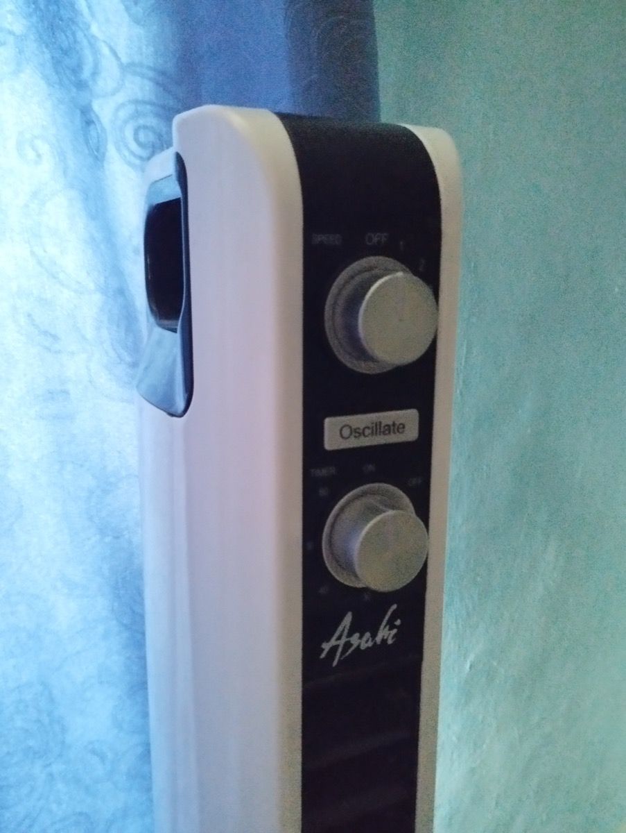
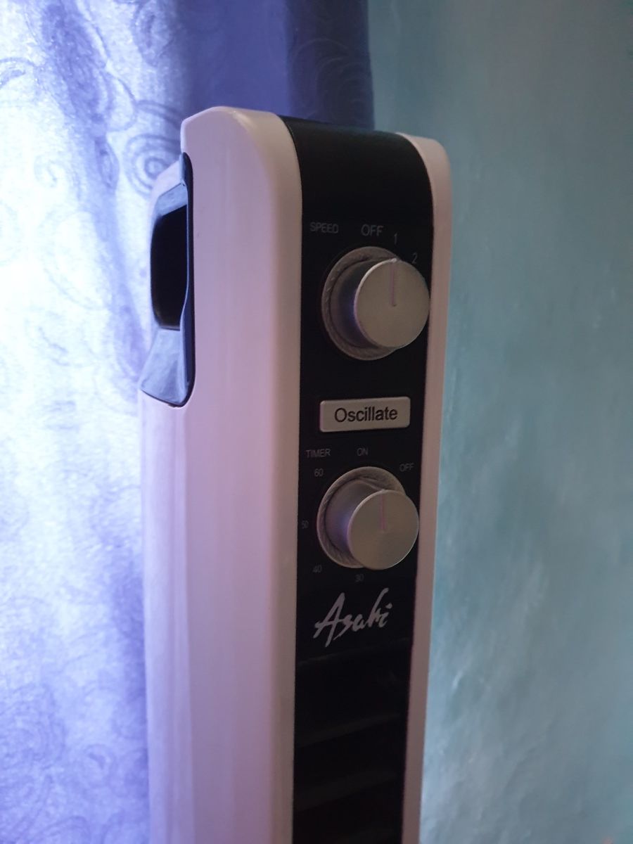
Here's another low-light scene, a shot of the controls on my bedroom electric fan. Unlike the Galaxy S9's single lens with optical stabilization, none of the Redmi Note 11's camera modules have any sort of image stabilization, and that shows here. The labels on the timer knob are completely unreadable on the photo from the Redmi, while you can still make them out on the photo from the Galaxy.
Also, note that the Redmi Note 11's video capabilities top out at 1080p@30fps. Not even 60fps! I mean, come on. My brother's Redmi Note 7 from three years ago can do 1080p@120fps. I didn't even bother taking sample videos for this because it's so bad. Don't bother with portrait mode here, either.
Suffice it to say that I'll be keeping my Galaxy S9 around, even if it's just for the camera.
MIUI 13
I avoided Xiaomi's products for the longest time, for the sole reason that I disliked its design philosophy: put simply, MIUI is a tribute to iOS. I wouldn't go as far as to say that MIUI is an iOS clone. Though, with its extensive usage of blurred backgrounds and rounded corners, you'd be forgiven for thinking that.
There is no denying, however, that Xiaomi's phones are very good for the prices they're sold at, and thus I was willing to stomach MIUI just to have a reasonably priced phone.
I won't be reviewing MIUI here as there are far better, more in-depth reviews out there for MIUI, and thus I will be focusing on the quirks I've seen so far.
The MIUI launcher and work profiles
It's a launcher. It's an app meant for displaying and launching apps. Very difficult to screw up. MIUI 13's default launcher is good enough, like most OEM launchers. Nothing to write home about.
If you use this for work or for otherwise separating your apps into personal and work profiles, however, be aware that there is a bug in the launcher that will cause the Work profile toggle to disappear after some time. You can get it back by switching to and back from Classic mode in the Home screen settings.
It does not help that MIUI 13 no longer has a Control Center toggle for the work profile, so if you use this feature, expect regular visits to the Settings app to get the launcher work profile toggle back.
Screenshots
MIUI 13 allows you to take screenshots using either the Volume Down + Power key combination or a swipe down the screen with three fingers. That's all well and good, but one thing I sorely miss from Samsung's One UI is the ability to take partial screenshots. Strangely enough, MIUI 12 was reported to have this feature, so to see it missing in this newer release is rather disappointing.
One thing I don't miss from One UI, which is unfortunately present in MIUI 13, is that screenshots are saved in the same folder as pictures taken with the Camera. I'm sure not everyone sees this as a problem (otherwise why would it be the default behavior?) but having screenshots saved into the Camera folder causes Google Photos to back them up to the cloud as well, which is rather annoying.
Floating windows
As far as I can see, MIUI's implementation of floating windows is specific to MIUI, since most other implementations I've seen only make use of "bubbles" or floating app icons. MIUI takes this a step further and opens most apps as floating windows if you swipe down on their notifications.
This is a non-issue for MIUI veterans, but since I've been using One UI and AOSP exclusively for all of my past phones, this system behavior has me perplexed. When I swipe down on a notification, I expect to reveal the rest of my notification shade, as though I swiped down from the status bar itself. I haven't seen a way to turn this behavior off, either; the Floating windows screen in the MIUI settings app only shows you how to use them, not how to switch them off.
Thankfully, swipes to the side still dismiss notifications like normal, and I'm sure I can learn to live with floating windows. I just thought I'd mention it in case you're a first-time MIUI user like me.
On the topic of notifications, however...
Notification shade
To tune MIUI to the limited performance offered by the Snapdragon chip in this phone, Xiaomi has disabled most of MIUI's blur effects on the Redmi Note 11. Unfortunately, this includes the background of the notification shade, which creates a problem: the notification shade background is permanently a light grey. This is not a problem for light mode users, but is a very unsightly problem for dark mode users, as almost everything else in the UI is dark except for the notification shade.
Automatic brightness
I'm not sure why, but the automatic brightness feature on MIUI consistently dials in brightness values that are a bit too low. I always find myself adjusting it manually, to the point that I had to disable automatic brightness altogether.
This would have been fine if MIUI had some sort of machine learning in place for the automatic brightness system like One UI does, but unfortunately, it does not. The screen itself does get very bright, however.
The good
I've already gotten the bad things out of the way, so let's talk about the good things!
Screen
The panel on the Redmi Note 11 is AMOLED, capable of either 60Hz or 90Hz refresh rates. The colors are nice and punchy, but not to the point of oversaturation. The blacks are nice and deep, as expected from an AMOLED panel. There is no HDR support here, but it gets plenty bright, and the phone itself has Widevine L1 certification, which means Netflix is able to stream content in Full HD.
Battery life and charging
The Redmi Note 11 is equipped with a 5,000 mAh battery. That alone does not equate to good battery life, since what actually uses the battery plays a huge factor too, but thankfully you don't have to worry about that with this phone.
Battery life is stellar, with usage easily stretching beyond a day if your usual tasks do not include anything heavy such as gaming. I personally use the phone mostly to scroll through Twitter and watch Instagram stories, and the Redmi Note 11 had no problem powering through those tasks for a day and a half before needing to recharge.
Adequate charging speeds are part of the battery life conversation, too. Impressively, Xiaomi includes a 33-watt charger in the box, which is ridiculously fast for a phone this cheap. You can charge the Redmi Note 11 from flat to full in about 1 hour and 30 minutes using that charger, and you can even see the battery percentage going up in real-time. I'm not sure how accurate that is, or if charging this quickly is even safe for the battery in the long run, but you can't turn it off so there isn't really a choice.
Note, however, that my experience was based entirely on using the phone in 60Hz mode. Cranking up the display to 90Hz will shorten battery life somewhat, and honestly, 90Hz is not as big of a difference from 60Hz as 120Hz. It is up to you if you want to use that or not.
Audio
The phone has stereo speakers, one on the top and another on the bottom. Together they make for a perfectly adequate listening experience, with music sounding okay when you crank it up to acceptable volumes. Set the volume all the way to 100% and you start hearing noticeable distortion. There's not much bass to speak of here, regardless of volume, but overall these are good speakers and, more importantly, the stereo sound is balanced.
There is also a headphone jack present, which was a breath of relief considering the trend of phones forgoing it in favor of wireless headphones. Apparently, the DAC in the Redmi Note 11 supports up to 24 bits @ 192 kHz, but I do not have the equipment to test that, so I will take Xiaomi's word for it. Output is nice and clean, with no noise to speak of. No Dolby Atmos support here, so if you are an Apple Music subscriber, keep that in mind.
I was very pleased to find that MIUI has its own implementation of Samsung's Adapt Sound. For those who do not know, Adapt Sound is an audio accessibility feature specific to Samsung Galaxy devices spanning all the way back to the TouchWiz era. It works basically like a hearing test: a series of tones at different frequencies are played through your earphones, one by one for each ear, and you are asked to confirm whether you hear each tone or not. The phone uses that information to tune its audio output such that you can better hear the frequencies that your ears have trouble with. The difference is nothing short of amazing— songs sound fuller, crisper, and generally more pleasant, all without requiring you to adjust EQ manually.
Xiaomi's implementation works the same way, and it is located under the rather unassumingly-named Volume adjustment screen under Sound & vibration → Sound effects in the Settings app.
Final thoughts
For a price of Php 9,999, you get a lot of value in such a light package, you'll be hard-pressed to find anything to seriously complain about. Be careful, however, not to expect your experience to be flawless. This is a budget phone, after all.
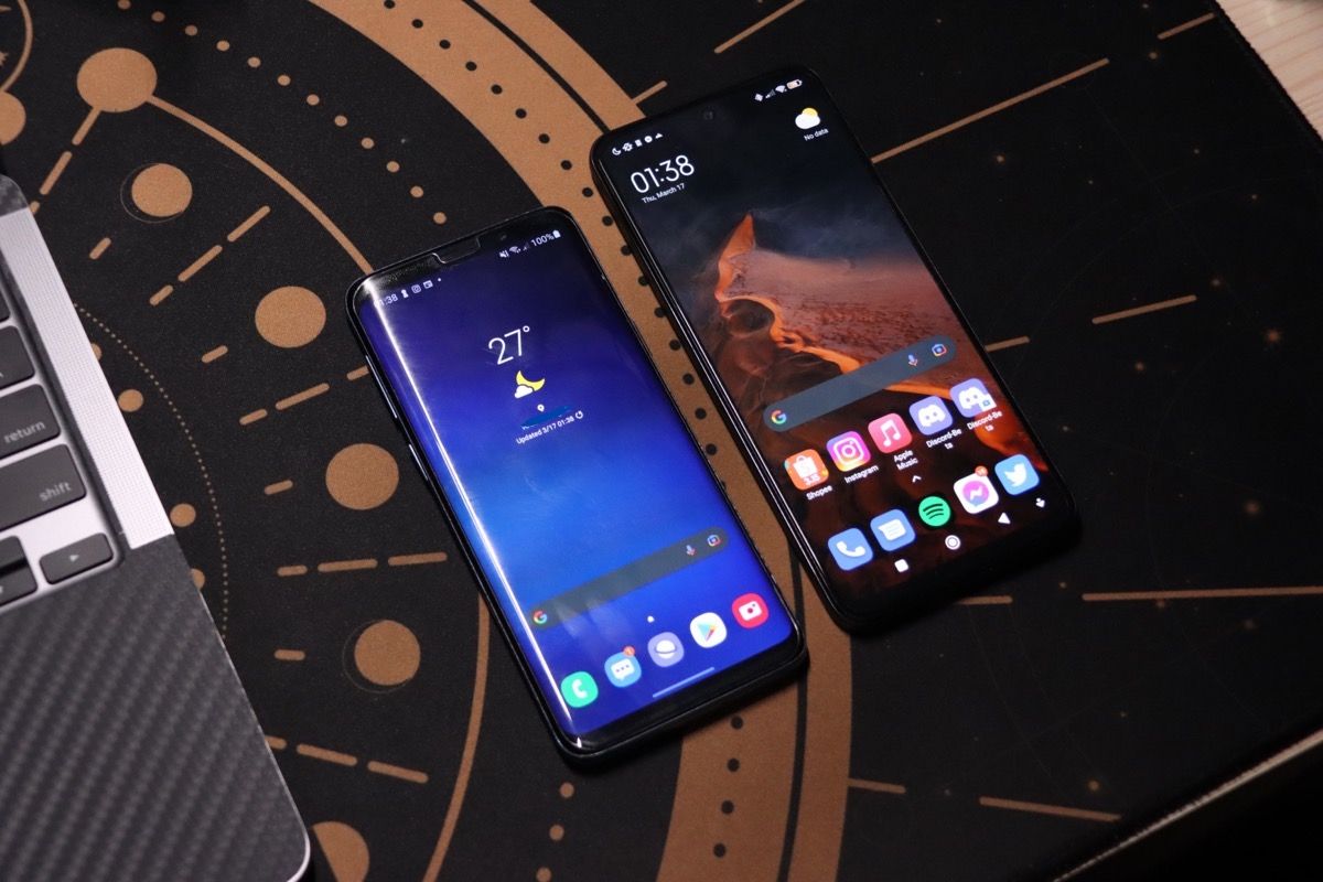
The Redmi Note 11 has been a fantastic phone so far. Barring the camera, most of the issues I've had with it were things that I could learn to live with, and there hasn't been anything I found that made the phone a potential dealbreaker for me. I'll still be keeping my Galaxy S9 around for the camera, but the Redmi Note 11 works well for everything else.
Rating: 4 ⭐️ / 5

Comments ()